- The layout now uses CSS grids
- We try to generate as much HTML as possible on the server, instead of using the DOM
- Placeholders are in pure CSS now!

You can't publish articles anymore, but it looks nice!!
* Start to update the theme

- Ligther colors
- No more border radius
- Buttons are now always colored
- Start to redesign the post page (according to the Figma mockups)

* Fix build script: it now recompiles everytime a scss file changed

* Make sure the article illustrations are not too big

* Make articles wider (70 characters)

* Better contrast between gray shades

* Various improvements

* Better mobile style

* New style for the footer

* Improve comment style

* Better responsiveness again

* Limit the size of the article cover

* Last details?

- Improve buttons on the media page
- Improve lists

* Pin the stdweb version that we use

It changed because I removed Cargo.lock to handle a merge conflict

I could have updated cargo web too, but it mean I should have re-built
the CI docker image and it was taking forever.

* Better contrast for links in the header of the article

* Add a basic privacy policy

* Remove "also"

* Fix a few issues

- Don't watch static/css in build.rs
- Another shade of white
- Remove useless margin rule for error messages
- Make it possible to insert new paragraphs in the article body
- Make it impossible to copy formatted HTML (to make media insertion from markdown code work correctly)

TODO:

- [x] make it possible to escape draft mode
- [x] display errors from the server
- [x] button to go back to the "normal" editor
- [x] Avoid publishing placeholders
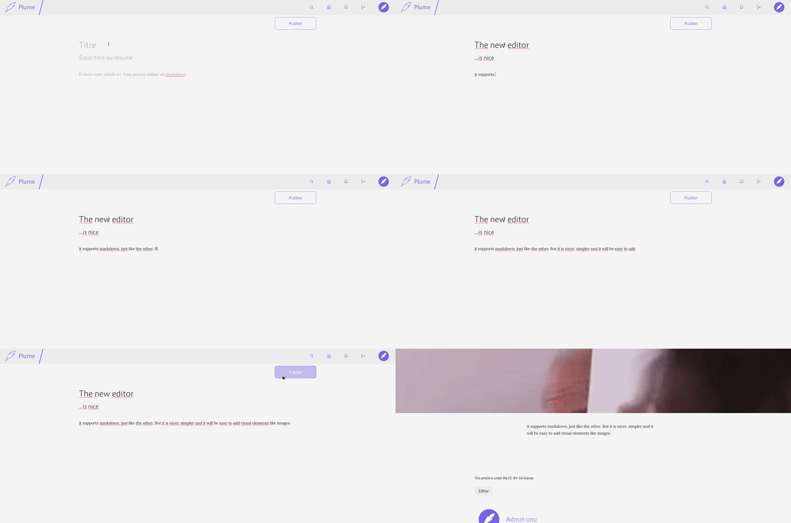
With this PR, when JS is activated and WASM supported, the article editor will be dynamically replaced with `contenteditable`s elements. This makes the editing interface simpler and less like a regular form. It will also allow us to easily add visual formatting with native browser APIs (and to insert images or videos directly). Here is a little demo:

There is still a lot to do, but it is a good first step.
Fixes#255
This change also remote all units for line-height to have more consistent styles and better cascading support. This solve the too small line height for multi line header in article and also add styling for h1 to h6 (previously h3 to h6 was not styled at all)